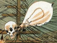
I think the point is that the cover is never guaranteed to accurately represent the book.
Quality of cover =/= quality of book
Although, I’ll never buy a book where the author’s name is in bigger, bolder font than the title of the book.
I hate that trend in cover design and I refuse to support it.
DEAN KOONTZ
Newbury Award Winner
New York Time Best-Seller
The Lake Boat
First time in paperback!
With a Foreward by David BaldacciIs this still a thing? I thought this was mostly popular in the 90s and dropped out of popularity in the last couple decades.
Definitely still see it for Stephen King at least, but frankly I’d be creeped out if I saw his name small at this point…
Yeah, the point of a book cover is to sell the book…
The point of a book cover is to cover the book.
That’s one of the purposes of a cover, you could achieve it without any design effort.
But that’s not the point, not the main purpose of a book cover. Your previous poster is right, the cover is advertising the book.
The “cover art***” sells it, then. They were trying to be funny I think lol
That’s the point of a dust jacket.
I thought the point of the dust jacket is to make books look shabby when they get crinkled and torn, so you can take it off and find a perfectly serviceable cover underneath.
Maybe, the point still stands. I’ve read awesome books with boring covers and vice versa. Its really a good saying that does apply to most areas in life.
No. Some are richly designed to showcase the book contents and others are not. That’s the entire point! It’s not the books with fancy covers that are always the best. You could find a plain cover copy of The Hobbit in your local library next to another copy that is oversized with a gold-embossed cover and an amazing painting showing the party of 14 plus a Wizard huddled on a mountaintop against the storm…
…and they’re still the same book.
My copy of The Hobbit is really weird it’s just leather and says The Hobbit in gold inset writing.
Absolutely nothing on the back, or even a barcode.
Really old books tend not to have covered designs that seems to be a relatively modern phenomenon.
deleted by creator
The US covers of Harry Potter (yeah I know) are awful and a good example of the artist having differently not read the book.
It’s generally used metaphorically. It just means you shouldn’t judge something based on appearances.
And modern book covers are designed to get you to pick up the book. Amazing covers don’t mean the book is necessarily good, it just means they had a great designer.
Yes, but you still don’t know if the content is good or bad.
My go-to phrase now is , “don’t judge a book by its movie.”
What they did to Foundation should be a crime.
The made interesting and visually engaging? Oh and soandso is a black woman now.
Yes, clearly racism is the biggest reason to hate the Apple TV version. Not that the writers didn’t understand the point of the books and turned Asimov’s original thoughts on society into magic and mysticism.
It wasn’t when the idiom was coined. Have you seen hard-bound books from the 19th century in libraries?
didn’t most books look the same back then?
Maybe book covers should be auto-generated from the entire text fed to an AI artist
I run Stable Diffusion on my computer, can you think of a relatively short novella to try this with? I have no idea what the limit for tokens is. To really “tech bro” it up we could feed it to an AI summarizer first.
This seems most appropriate just have it generate one for each short story.
Unless they’re “as seen in the hit TV show!” in which case it’s okay to tear those covers off.
It was very true for movies in the 80s. The cover would sometimes not have anything to do with the movie at all. Horror and sci-fi movies would show monsters that never appeared in the movie.
It’s not though. Books can, but don’t always, misrepresent themselves on the cover. Just like people.
It’s not saying that book covers always lie, it’s saying that you shouldn’t take everything at face value and you should think for yourself.
I was told that the rest of the saying is “but it’s a good place to start.”
I don’t know aye, I have read some books that were amazing. Although the cover was really, really bad.
I’m going to say it’s like a chicken and egg scenario.
It’s recommended that you don’t judge a thing or a person based on a quick glance. That’s good advice.
Book covers are designed specifically to be judged at a quick glance because they know that’s what people do, despite the advice they were given.
I think it’s also true in reverse. Like if the book cover looks really cool but the story is hot garbage.


